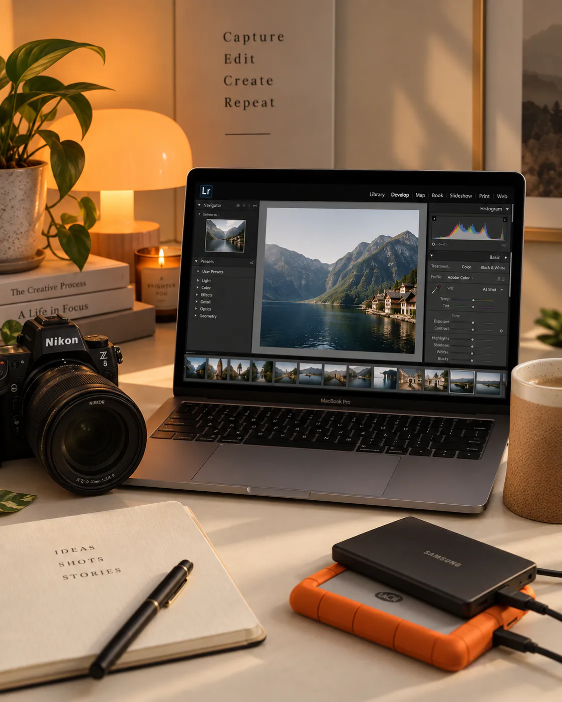

You can spend hours editing a photograph in Lightroom, perfecting the colours, skin tones, contrast and details, only to upload it to Instagram and wonder why it suddenly looks soft, blurry or different from the version you edited.
If that has happened to you, your Lightroom edit may not be the problem. Your export settings could be.
Knowing the right Lightroom export settings for Instagram makes a noticeable difference to how your photography looks after uploading.
Instagram processes and compresses uploaded images, so giving it a correctly sized, properly sharpened and colour managed file gives you a much better starting point.
As a photographer, I don’t want my final image to look perfect inside Lightroom and then lose that polish when it reaches Instagram. My goal is always to make the exported file as Instagram ready as possible before uploading.
In this guide, I’ll show you the best Lightroom export settings for Instagram in 2026, including the recommended file format, dimensions, JPEG quality, colour space, sharpening and metadata settings.
Table Of Contents
Quick Answer: My Recommended Lightroom Export Settings for Instagram
If you want the short version, start here.
| Lightroom setting | Recommended setting |
|---|---|
| File format | JPEG |
| Colour space | sRGB |
| Quality | 80 to 90, start at 85 |
| Portrait feed | 1080 × 1350 or 1080 × 1440 |
| Square feed | 1080 × 1080 |
| Landscape feed | 1080 × 566 |
| Stories and Reels | 1080 × 1920 |
| Output sharpening | Screen, Standard |
| Resolution | Not important for Instagram |
| Metadata | Copyright information only |
| Location data | Remove if preferred |
| Watermark | Optional |
| HDR | Avoid at all costs, looks super weird when posted |
Adobe’s current Lightroom export tools allow you to choose JPEG, set custom dimensions, control quality and select colour space, while Lightroom Classic also gives you dedicated image sizing and output sharpening controls.
Now let’s break down why these settings matter.
Lightroom Export settings for Instagram Checklist
1. Use JPEG for Instagram
For most photography posts, I recommend exporting your Lightroom image as JPEG.
JPEG is a compressed format, but that isn’t necessarily a bad thing. You’re creating a delivery file rather than an archival master.
Adobe describes JPEG quality as controlling the amount of compression applied during export.
For Instagram, a high quality JPEG gives you a good balance between image quality and file size.
This is one of the most important settings in your Lightroom export workflow.
For standard Instagram photography, I recommend:
Colour Space: sRGB
If you edit your photographs using a wider colour space or on a wide gamut display, your exported image still needs to make sense across phones, browsers and social platforms.
Lightroom Classic allows you to convert your exported JPEG into sRGB directly from the export dialog.
This is particularly important if you’re working with:
- Skin tones
- Bright reds
- Orange sunsets
- Green foliage
- Blue skies
- Turquoise water
- Neon lights
- Highly saturated colours
If you’ve ever thought:
“Why does my photo look different on Instagram?”
Colour management is one of the things worth checking.
Also Read: Instagram DM Automation: Why You Need It + Why Zorcha’s Free Plan Is Actually Good
3. What JPEG Quality Should You Use?
This is where I see a lot of photographers overcomplicate things.
You don’t need to export every Instagram photograph at 100% quality.
I recommend starting with:
JPEG Quality: 85
You can experiment within the 80 to 90 range, depending on the photograph.
For most of my Instagram photography, 85 is an excellent starting point.
A quality setting of 100 produces a larger file, but that doesn’t necessarily mean Instagram will display it better after processing the upload.
At the other extreme, exporting at very low quality means you’re compressing the image before Instagram gets the chance to process it.
So instead of:
Lightroom → huge JPEG → Instagram compression
or
Lightroom → heavily compressed JPEG → Instagram compression
aim for:
Lightroom → optimized JPEG → Instagram
The goal isn’t to eliminate Instagram’s compression. You can’t completely control that.
The goal is to give Instagram a good quality source file.
Want to speed up your Lightroom workflow?
These are the Lightroom presets I use to create my signature photography looks. Start with the collection and then fine tune the settings to suit your own images.
Explore my Lightroom Presets here – Pro Photo Editing Bundle – Lightroom Presets (Set of 4)
4. What Size Should Instagram Photos Be?
This is where things have evolved, so don’t blindly follow old Instagram tutorials that tell you every image must be 1080 × 1080.
Instagram supports multiple aspect ratios, and the dimensions you choose should depend on what you’re posting.
For a standard photography feed, these are useful export sizes:
1080 × 1350 px | Aspect ratio: 4:5
This remains an excellent compatibility choice for portrait feed posts.
For photographers who want to use the newer taller portrait format, you can also work at:
1080 × 1440 px | Aspect ratio: 3:4
The important thing is to crop intentionally before exporting rather than allowing the platform to make decisions about your composition.
1080 × 1080 px | Aspect ratio: 1:1
This works particularly well when your composition is naturally square or you’re creating graphics.
1080 × 566 px | Aspect ratio: approximately 1.91:1
This is useful for wider landscape photographs.
1080 × 1920 px | Aspect ratio: 9:16
This is the standard vertical canvas you should work with for Stories and Reels.
Instagram is increasingly a video and messaging first platform, and Meta says messaging has become one of the most popular ways people share photos and videos on Instagram.
So if you’re creating photography specifically for Instagram, think beyond just the traditional square feed.
Also Read: Hotel Collaborations for Creators: Proven Ways to Pitch Hotels, Win Deals and Get Hired
5. Don’t Worry About 72 DPI
You’ve probably seen countless Lightroom tutorials telling you:
Set resolution to 72 DPI for Instagram.
This isn’t particularly important.
For Instagram and other digital platforms, pixel dimensions matter far more than the DPI or PPI number.
A photograph that is 1080 × 1350 pixels remains that number of pixels regardless of whether Lightroom displays the resolution as 72 PPI, 150 PPI or 300 PPI.
Adobe’s export documentation separates resolution from pixel dimensions and explains that resolution is primarily relevant to print output.
So don’t obsess over DPI when preparing images for Instagram.
Focus on:
Correct crop + correct pixel dimensions + JPEG + sRGB + appropriate quality.

@garimashares
Photography, travel, creator tips, hotels, behind the scenes and visual storytelling.
Follow @garimasharesAlso Read: 6 Steps to Connect Instagram to Google Search Console & Unlock Powerful SEO Insights
6. Should You Use Lightroom’s Output Sharpening?
Yes.
For photographs going to Instagram, I recommend:
Sharpen For: Screen
Amount: Standard
Lightroom Classic has a dedicated output sharpening option that applies sharpening based on the intended output medium and resolution.
This is different from the sharpening you apply during your actual Lightroom edit.
Your Develop sharpening helps make your photograph look right during editing.
Output sharpening is applied during export for the final destination.
Lightroom vs Lightroom Classic: What’s the Difference?
If you’re confused by Adobe having two versions of Lightroom, you’re definitely not alone. Lightroom Classic and Lightroom are both powerful photo editing applications, but they are designed around different workflows.
Lightroom Classic is the desktop focused version and stores your original photos on your computer or connected drives. It offers a more comprehensive set of organization, editing, export and professional workflow tools, making it particularly useful for photographers working with large photo libraries.
Lightroom, sometimes still called Lightroom CC, is Adobe’s cloud based version. It works across desktop, mobile and web, with your original photos automatically synced to the cloud so you can access your library from different devices. It has a cleaner, more streamlined interface and automatic photo tagging and search.
7. Don’t Export Your Instagram Photo and Then Compress It Again
This is a surprisingly common mistake.
You edit in Lightroom.
Then you export the image.
Then you send it to yourself through WhatsApp.
Then WhatsApp compresses it.
Then you save that version.
Then you upload it to Instagram.
You’ve just introduced another layer of compression before Instagram even sees your image.
Instead, transfer your exported image using:
- AirDrop
- iCloud
- Google Drive
- Dropbox
- A cable
- Lightroom sync
- Another original quality transfer method
The idea is simple:
Edit → Export → Transfer at original quality → Upload
Not:
Edit → Export → Compress → Compress again → Instagram
Also Read: Instagram Monetization Requirements Explained: Proven 2026 Guide to Earning Money
8. Check Your Exported Image Before Uploading
Don’t judge the final image only inside Lightroom.
After exporting, open the JPEG and look at it on your phone.
Check:
Skin tones
Are they still natural?
Highlights
Did bright areas become too harsh?
Shadows
Did dark areas become muddy?
Fine detail
Does hair, fabric or architecture still look clean?
Grain
Does your film grain still look intentional?
Colour
Do reds, oranges and greens still look like they did in Lightroom?
This is especially important if you sell or use Lightroom presets.
A preset can look beautiful inside Lightroom but need slight adjustments depending on the photograph and the way the final image is being displayed.
9. Why Do My Colours Change on Instagram?
If your Instagram image looks warmer, cooler, more saturated or flatter than your Lightroom version, start with your colour workflow.
First check that you’re exporting in:
sRGB
Then check the photograph on your actual phone.
Your monitor and phone can display the same image differently.
This is especially noticeable with:
- Skin tones
- Reds
- Oranges
- Greens
- Blues
- Neon colours
Also remember that display settings such as brightness, True Tone and other device settings can affect how an image appears to you.
Don’t immediately assume Instagram has ruined your edit.
Compare the actual exported JPEG outside Lightroom first.
Final Thoughts
Getting your photographs to look good on Instagram isn’t only about having a great camera or creating a beautiful Lightroom preset.
The final export matters too.
The best Lightroom export settings for Instagram are designed to give Instagram a properly sized, colour managed, high quality file before its own processing takes over.
For most photographers, my starting point is simple:
JPEG + 85 quality + sRGB + the correct pixel dimensions + Screen/Standard sharpening.
Save those settings as Lightroom export presets and your workflow becomes much faster.
And remember, don’t obsess over creating a technically perfect file that looks identical to your Lightroom master on every screen. Instagram is a social platform with its own processing pipeline. Your goal is to create a strong, consistent source file that survives that pipeline well.
That’s the workflow I would use for professional photography, travel photography, hotel photography, portraits and everyday Instagram content.

Subscribe to never miss a post!
Leave a Reply