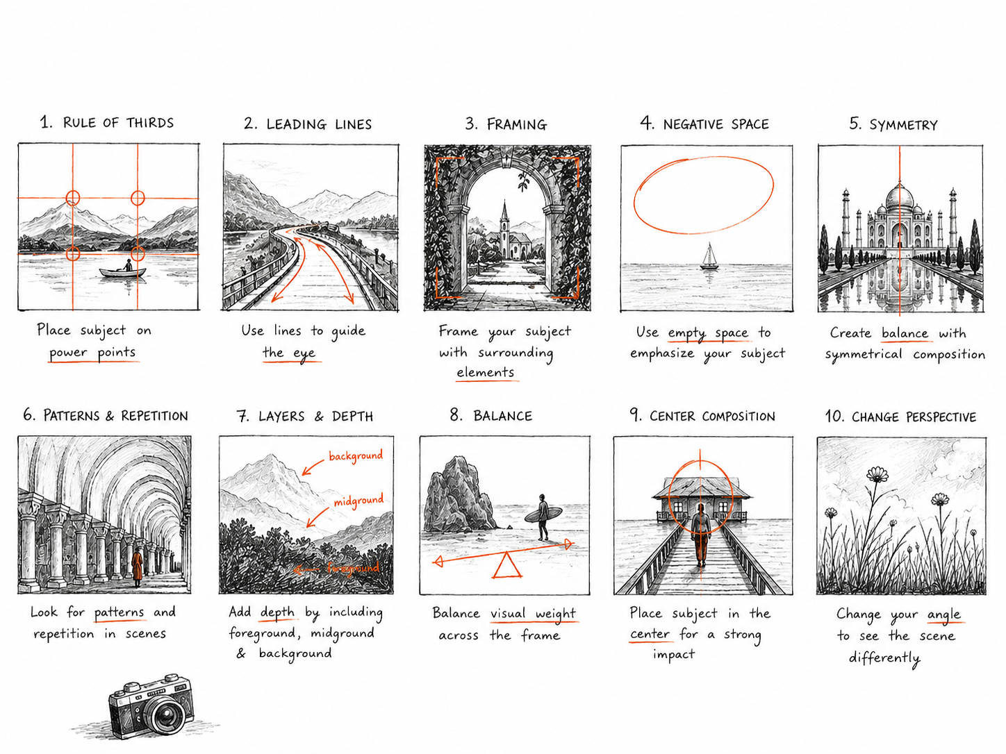

Composition in Photography makes your pictures look clean instantly.
You can have the most expensive camera, the sharpest lens and the most beautiful light, but if the elements inside your frame are not working together, the photograph can still feel flat.
On the other hand, some of the most memorable photographs I have seen were made with incredibly simple equipment because the photographer understood how to place things within the frame.
Composition in photography is essentially about how you arrange everything inside your photograph. It is where your subject sits, what you include, what you leave out, where the viewer looks first and how their eye moves through the image.
And while there are plenty of photography composition rules you can learn, I have always believed that rules are most useful when you understand why they work.
Once you understand the intention behind a composition technique, you can decide when to follow it and, more importantly, when to break it.
After years of photographing people, places, brands and everyday moments, composition has become less about consciously thinking about rules and more about instinct. But that instinct comes from repeatedly training yourself to notice relationships between shapes, people, light, colour, space and movement.
Here are some of the most useful composition techniques in photography, how they work and when I would actually use them.
Table Of Contents
What is Composition in photography?
Composition in photography refers to the way visual elements are arranged within a frame.
Think of your photograph as a canvas. Everything you place inside that canvas has an impact on the final image.
Your subject, the background, the empty spaces, lines, shadows, colours and even tiny objects at the edges of the frame can either strengthen your photograph or distract from it.
Good composition does not necessarily mean putting everything in the perfect place. It means creating visual intention.
Sometimes that means making your subject the obvious focal point. Sometimes it means creating a sense of chaos. Sometimes it means using empty space to make a person feel small. And sometimes the most interesting composition is one where the viewer has to spend a few seconds figuring out what is happening.
That is why I would not recommend treating composition as a checklist.
Instead, ask yourself one simple question before pressing the shutter:
What do I want the viewer to notice first?
That question alone can completely change the way you photograph.

1. Rule of thirds
The rule of thirds is probably the most well known composition technique in photography, and there is a reason it is taught so often.
Imagine dividing your frame into nine equal sections using two horizontal lines and two vertical lines. The points where these lines intersect are called power points. Placing your subject around these points can create a naturally balanced photograph.
For example, if you are photographing a person looking towards the right side of the frame, placing them towards the left third gives them space to look into.
This is particularly useful for portraits, landscapes, travel photography and lifestyle photography.
But here is where I think photographers sometimes misunderstand the rule.
Cinematic LUTs for videos (Set of 3) | Compatible with DaVinci Resolve
Colour-grade videos in a single click!
Install the free version of DaVinci Resolve and start using these LUTs on your videos to give them a cinematic look without compromising their quality

You do not have to place your subject exactly on one of those lines every single time.
The real idea is to avoid automatically putting your subject in the centre. Move around. Change your perspective. Give the subject room to breathe.
And once you understand why off centre compositions work, you can deliberately place your subject in the centre when you want a completely different feeling.
2. Leading lines
Leading lines are one of my favourite ways to make a photograph feel more dynamic.
A leading line is any visual line that guides the viewer’s eye towards a particular part of the photograph. It could be a road, staircase, railing, wall, architectural structure, shadow or even a row of people.
The line does not necessarily have to be straight.
Curving roads, winding paths and naturally occurring shapes can also lead the eye through an image.
When photographing architecture, I actively look for lines that point towards my subject. When shooting travel photographs, roads and pathways can create a natural sense of depth and movement.
The key is not simply finding a line.
Ask yourself where the line is taking the viewer.
A line that leads directly towards your subject is useful because it creates a visual journey. A line that leads the eye out of the frame can also work, but it creates a very different feeling.
So before using leading lines, look at the entire path created by that line.
Also Read: Best iPhone Camera Settings For Crisp Reels (Bonus Instagram Settings Too)
3. Framing
Framing is essentially using elements within your environment to create a frame around your subject.
This can be a doorway, window, arch, curtains, branches, buildings or even people standing around your subject.
I love this technique because it adds context to an image while also telling the viewer where to look.
Imagine photographing someone standing inside an old doorway. The doorway naturally separates them from the rest of the scene and creates a visual boundary around the subject.
You can use framing particularly effectively in travel and street photography because you often have interesting architectural elements around you.
The trick is to avoid adding a frame just because you can.
The frame should contribute something to the photograph. It should either draw attention to the subject, create depth or add context.
Sometimes a partial frame is much more interesting than a perfect frame around the entire subject.
Also Read: 14 Creative Instagram Post Ideas for Photographers to Increase Followers and Engagement
4. Negative space
[first image in the carousel above is an example of using negative space to frame your shot]
Negative space is one of the most powerful composition techniques in photography, especially when you want your image to feel minimal, calm or editorial.
Negative space is the relatively empty area surrounding your main subject.
It could be a huge sky, a plain wall, a quiet stretch of floor or a large area of water.
One of the biggest mistakes photographers make is feeling like every part of the frame needs to contain something interesting.
It doesn’t.
Empty space can be interesting precisely because it is empty.
When I am photographing a person against a large architectural wall or an expansive landscape, I will often deliberately give them much more space than they technically need.
That space changes the story.
A person surrounded by empty space can feel isolated, peaceful, tiny or contemplative depending on the context.
Negative space is particularly useful for commercial photography and social media because it can also create room for text, branding or graphic elements without making the image feel crowded.
5. Symmetry
Humans naturally respond to symmetry, which is why symmetrical photographs can feel incredibly satisfying.
Architecture is one of the easiest places to find symmetry. Look for buildings, corridors, staircases, windows, doors and reflections.
The important thing with symmetry is precision.
If you are intentionally creating a symmetrical composition, small inconsistencies can become much more noticeable. Take your time to align your camera properly and pay attention to the edges of the frame.
But symmetry does not have to mean perfect architectural symmetry.
You can also create symmetry through people, objects, colours or reflections.
And one of my favourite ways to make symmetry more interesting is to introduce one element that breaks it.
A perfectly symmetrical scene with one person standing slightly off centre, for example, immediately creates tension.
That small disruption gives the viewer something to look at.
6. Patterns and repetition
Patterns create rhythm in photographs.
Repeated windows, chairs, shadows, people, tiles, flowers or architectural details can create incredibly strong compositions.
Our eyes naturally recognise repetition, so patterns can instantly make an image feel organised.
The fun part is finding the moment where the pattern changes.
Imagine a row of identical windows with one window open. Or a group of people wearing similar colours with one person dressed completely differently.
That interruption becomes the focal point.
When you see repetition around you, do not immediately photograph the entire scene.
Get closer.
Fill the frame.
Remove distractions.
Look for the one element that breaks the pattern.
This is particularly effective in street photography, architecture and travel photography.
7. Layers and depth
One of the easiest ways to make a photograph feel more three dimensional is to introduce layers.
Instead of having just a foreground and background, look for something happening in the foreground, your main subject in the middle ground and another element in the background.
This gives the viewer a sense of moving through the photograph.
When I am photographing a person outdoors, I might intentionally place something slightly out of focus in the foreground. It could be leaves, another person, an architectural element or even a reflection.
The foreground creates depth.
The subject gives the image its story.
The background provides context.
You do not need an expensive lens to create this effect. You simply need to start noticing the different planes around you.
Move closer to objects. Shoot through things. Let elements overlap.
Photography is a two dimensional medium, so creating the illusion of depth is one of the best ways to make an image feel immersive.
8. Balance
Balance in photography is about how visual weight is distributed throughout your frame.
Your subject does not always need to be in the centre for an image to feel balanced.
Imagine a person standing on the left side of the frame and a large building occupying the right side. Even though the person is smaller, the visual weight of the building can balance the composition.
Balance can come from size, colour, contrast, brightness, texture or the number of objects in the frame.
This is something that becomes particularly important when photographing environmental portraits.
Instead of thinking only about your subject, look at everything around them.
Is there something bright pulling attention away from their face?
Is one side of the image much heavier than the other?
Is there an object in the background competing with your subject?
Learning to see visual weight will make you much more intentional with your compositions.
9. Centre composition
Now for one of the rules I love breaking.
Photographers are often told not to put their subject in the centre because it can make photographs feel static.
And yes, sometimes it does.
But centre composition can also be incredibly powerful when used intentionally.
A centrally placed subject can create symmetry, confidence, simplicity and visual impact.
This works particularly well with portraits, architecture and minimal photographs.
If your background is symmetrical or visually clean, putting your subject directly in the centre can make the photograph feel almost graphic.
Centre composition is also fantastic when you want the viewer to have nowhere else to look.
There is no visual guessing game.
You are saying: this is the subject.
Look here.
The important thing is intention. Do not centre your subject because you did not know where else to put them. Centre them because the composition benefits from it.
10. Change your perspective
Sometimes the biggest composition improvement you can make is simply moving your camera.
Get lower.
Get higher.
Move closer.
Step back.
Shoot from the side.
Photograph through something.
Look for a reflection.
A scene can completely change depending on where you stand.
This is especially important when photographing familiar subjects. If you photograph everything from eye level, your photographs can start to look visually repetitive.
Changing your perspective forces you to see the subject differently.
For portraits, shooting slightly lower can make the subject feel more powerful. Shooting from above can create a softer or more vulnerable feeling.
For architecture, getting low can exaggerate scale and make buildings feel monumental.
For food or products, changing the camera angle can completely alter how the textures and shapes interact.
Before you decide that a scene is boring, change your position.
You might simply be looking at it from the wrong place.
How to know which composition technique to use
This is where composition becomes less about memorising techniques and more about developing your photographic eye.
You do not need to look at a scene and think, “Today I am going to use the rule of thirds.”
Instead, start by asking what the photograph needs.
If you want to direct attention towards your subject, look for leading lines or framing.
If you want the photograph to feel quiet and minimal, look for negative space.
If you want it to feel structured, look for symmetry or patterns.
If you want depth, look for layers.
If you want something bold and graphic, consider centre composition.
If you want energy, experiment with diagonals, movement and perspective.
The technique should serve the photograph, not the other way around.
When should you break composition rules?
All the time.
Seriously.
The rules of composition are not laws.
They are tools.
Once you understand why a composition works, you can deliberately do the opposite.
You can centre your subject.
You can cut off someone’s head.
You can leave very little negative space.
You can place the subject right at the edge of the frame.
You can intentionally create imbalance.
Some of the most interesting photographs feel slightly uncomfortable because the composition creates tension.
That is often what makes us stop scrolling.
And in a world where we are constantly consuming photographs, getting someone to stop and actually look is a powerful thing.
The most important composition tip I can give you
Stop taking photographs only of your subject.
Photograph the relationship between your subject and everything around them.
Look at the space.
Look at the light.
Look at the background.
Look at the shapes.
Look at what is happening at the edges of your frame.
Look at what your subject is looking at.
Look at what they are standing next to.
Look at the empty space behind them.
This is where composition in photography really starts to become intuitive.
The more you practise seeing these relationships, the less you will need to consciously think about composition techniques.
Eventually, you will start noticing them before you even raise your camera.
And that, to me, is the real goal.
Not to create photographs that perfectly follow a list of photography rules, but to develop an eye that knows exactly why a frame feels right.
Final thoughts
Composition is one of those aspects of photography that you can keep improving forever.
You can learn the rule of thirds today and spend the next decade discovering new ways to use, bend and break it.
The more you photograph, the more you realise that composition is not really about rules. It is about communication.
Every decision inside your frame says something.
Where you place your subject.
How much space you give them.
What you allow into the background.
What you deliberately leave out.
Where you position yourself.
And ultimately, where you want your viewer’s eye to go.
So the next time you are out shooting, do not just ask yourself whether the photograph looks good.
Ask yourself why it looks good.
And if it does not, ask yourself what you can move, remove or change.
That habit will improve your photography far more than memorising another composition rule ever will.

Subscribe to never miss a post!
Leave a Reply