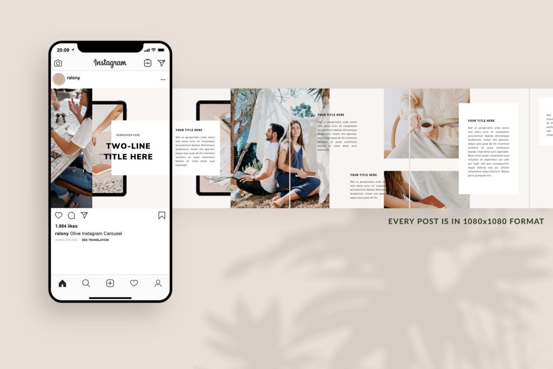
Instagram carousels are a great way to boost engagement on your profile. It is a type of post which gets more saves and shares.
Apart from the actual value, you provide through your Instagram carousels, the designing part plays an important role too.
If your design isn’t perfect, it can make people avoid reading the entire thing and just scroll away.
Table Of Contents
What are carousel posts on Instagram?
Instagram carousels can have a maximum of 10 slides in them. And thanks to the new update, now you can delete an individual slide from a carousel post without deleting the entire post itself.
A carousel can have a mixture of static & video slides in it.
Some people have DMed me saying that when they deleted the first image in the carousel, they lost the insights of that post. I’ve not got around to trying and checking this out yet.
Whether you’re a creator on Instagram or a small business, carousels are a great way for connecting to your audience.
A small business can use Instagram carousels for :
- New product launches
- Showcasing variants of a single product
- Brand Storytelling
- Multiple views of a product
- Product Tutorials
- Custom Recommendations
- Positive customer reviews
- User-generated Content
- Answering FAQs
- Announcing offers & discounts
Do you know what is a seamless carousel post design? It is when you swipe through different slides of a carousel, it feels like you’re moving the same page instead of moving from one image to another.
Here is a tutorial on how you can create a seamless carousel for Instagram without Photoshop, and here’s the other one using Photoshop.
7 Things to keep in mind while designing Instagram Carousels
1. Identify the purpose
Think and decide what’s the intent of your carousel before creating it. Do you want to teach people something? Do you want to start a conversation?
Video carousels get more engagement compared to photo posts so use them if your purpose is to start a conversation.
2. Try to use all 10 slides of Instagram carousels
Although it is not necessary to use all of the 10 slides, try to use them all because that’s an opportunity available for you.
Share more value through your carousel by taking advantage of it.
3. Keep it short
Don’t write a whole paragraph on a slide. Write a maximum of 2-3 sentences on one slide.
People have very short attention spans (I am people), and it is best if you say what you want to say in the shortest way possible.
If you’re not able to cut short your content, divide it into different carousels. Try and segment it.
4. Formatting
Just because you have space on the slide, doesn’t mean that your text has to cover the entire slide.
Keep the font size just the perfect size that is easy to read and doesn’t cover the entire screen like a tacky ad.
Your text shouldn’t touch the edges. Keep it aligned properly. According to research, it has been found that left-aligned text is easier to read compared to center-aligned text.
This is because when it’s left-aligned, the eyes don’t have to travel as much to find out the point from where the next sentence is starting. As each sentence starts from the same point when being left-aligned.
5. Use contrasting colors
Use contrasting colors in your design to make it pop and catch attention.
If you need some inspiration, head to Pinterest and type ‘color palette for social media design’ in the search bar.
6. Don’t clutter the design
Don’t go overboard and include too many elements on a slide.
It can make the design look complex and can be overwhelming for the viewer.
Use clean designs and elements that don’t overpower the text content of your Instagram carousels.
7. Add your brand logo/name
Add your brand’s logo or your own name to the design. You can put it in a corner.
Remember to keep it at the same position in all of the slides.
This will help people identify your post whenever they see it on their home feed. It enhances brand awareness.
Also Read: How to edit Instagram reels on beats of an audio
8. Treat your first slide as a HEADER
The only purpose of the first slide in the carousel is to act as a hook. Treat it as a header image.
Use your most compelling picture or tagline in it.
The rest of the slides can talk about the main content of the carousel, leaving the carousel only for grabbing attention.
The rest of the carousel, like the other images and the caption, can take care of the post’s other goals and get across the main message.
9. Give a reason to swipe through
You need to persuade people to keep swiping to the next slide.
Build suspense and connect each slide’s content to each other so that the reader would want to swipe to continue reading.
One of the ways you can do it is to ask questions.
You can even add a small element like an arrow pointing to the next slide, a hand emoji, etc.
10. Everything should be cohesive
Use the same font, branding elements, type of graphics, and colors across all your slides to keep the design cohesive.
The slides should look like they are a part of a single design and not individual images/videos.
Subscribe to never miss a post!


Leave a Reply